I decided just to put one pic up today, as it's a warm Sunday afternoon, and I fancy going for a walk!
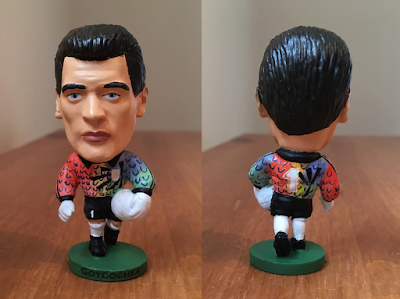
So here's a custom Sergio Goycochea figure:
It's in Argentina colours, in case you weren't sure, though I couldn't tell you the year.
Some people have said they think it's the best I've ever done. They guy I painted it for was pleased and he asked me what I thought. I said I thought it was good... but I like them to be perfect!!
To be entirely honest, I preferred it before I put the little dark blue 'U' shapes on it. (They are actually Argentina football crests on the real kit)
I loved the colour merging, and the black lines, but there was something about those U shapes that I couldn't get exactly right, in my own opinion. I think it's because on the shirt, they weren't straight! Makes it even harder than if they were, in a funny way!
Anyway, what do you think? One of my best?

